With LibreOffice 5.0 just around the corner, I thought I should share this awesome tutorial with you to make LibreOffice look better and enhance your productivity!
LibreOffice’s killer looks is just one of the many features it sports. Today I’ll be showing you how to change the default look to enjoy the awesome themes it has!
LibreOffice’s killer looks is just one of the many features it sports. Today I’ll be showing you how to change the default look to enjoy the awesome themes it has!
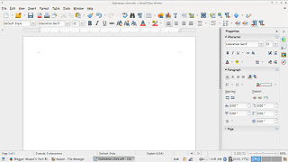
At first, let’s take a look at the default theme:
Not bad! It looks fresh and modern, especially if you are coming from “another” productivity suit, this one is called Tango and it’s the default theme. Now the question is: How to change the theme?
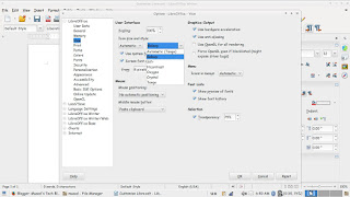
Navigate to: Tools Options View and choose the theme you like from: User interface Icon size and style.
There is a total of six themes available (Tango included) and we are going to take a look at all of them! Then I’m going to say which is the best one!
 |
|
Tango (Default theme)
|
 |
|
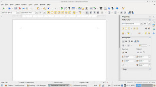
Crystal
|
 |
|
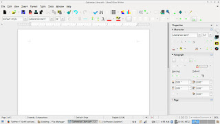
High contrast
|
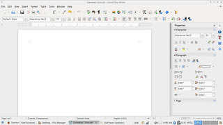 |
|
Oxygen
|
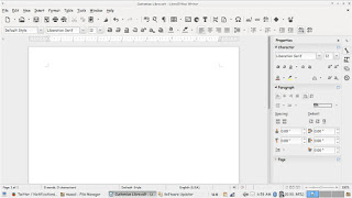 |
|
Sifr
|
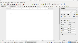 |
| weight: normal;”>Galaxy |
Pretty sweet, don’t you think?
And I’m willing to tell you the best one!
The best theme is the one you like the most and allows you to be most productive!
Which one is the one for you? Let me know in the comments section below!
I like Sifr btw 😉
